 Instacart
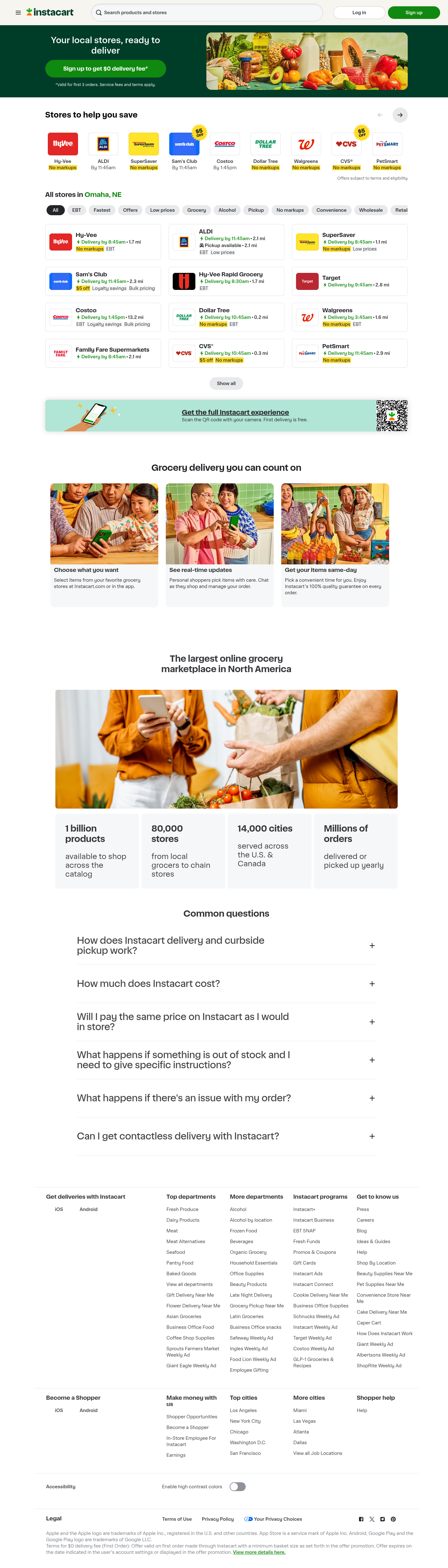
The hero has a single CTA and fine print but no star rating, App Store score or testimonial - nothing to reassure cold paid traffic at the decision point.
17 ad/analytics trackers load on first paint with no consent banner shown on a fresh US session - CIPA/CCPA exposure.
Catalog-scale stats (1B products, 80,000 stores) sit deep in the page, well below where the signup decision is made.
The $0 delivery fee offer and clear per-store cost labels are working well - protect these.
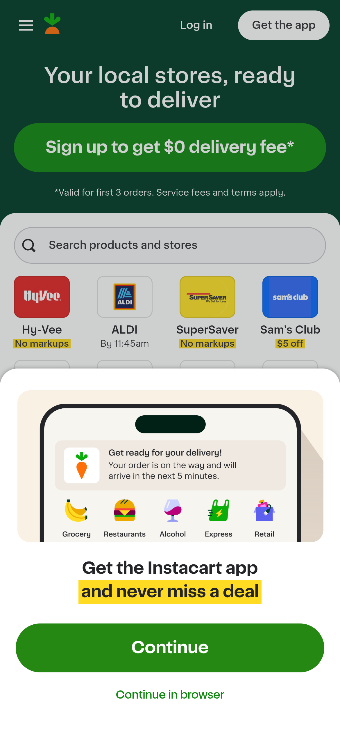
The green Continue routes to the App Store; Continue in browser is a small de-emphasized text link, adding friction for mobile-web shoppers.
Instacart is North America's largest online grocery marketplace, connecting shoppers with same-day delivery and pickup from more than 300 retailers and 80,000 stores across 14,000 cities. The homepage is a geo-aware storefront: it detects the visitor's location, surfaces nearby chains (Hy-Vee, ALDI, Costco, Sam's Club, CVS, Walgreens and more) with per-store delivery-fee and markup labels, and drives visitors toward a single primary action - sign up for $0 delivery fee on the first three orders. The experience is fast, polished and clearly the product of heavy optimization.
The measurement and acquisition stack is deep: Google Tag Manager (GTM-MNXM74G), three Google Ads conversion accounts (AW-435895001, AW-831001982, AW-868086294) firing through ccm/collect and DoubleClick remarketing, a Meta Pixel config (172640093204459), plus TikTok, Snapchat, Microsoft (Bing) and The Trade Desk pixels, Branch deep-linking and iSpot TV attribution. Performance is a genuine strength (first paint ~1.4s, minimal true third-party JavaScript). The gaps are not speed or capture - they are trust and governance: no customer sentiment shown at the decision point, an ad-tech layer that fires before any consent choice with Google Consent Mode v2 not wired, and a mobile flow that pushes app install ahead of letting people shop.
Mobile visitors get pushed to the app before they can shop
On mobile the app-install interstitial makes the green Continue button route to the App Store, while Continue in browser is a small de-emphasized text link. Visitors who will not install an app to buy groceries hit friction right at the entry point and some bounce.
Hypothesis: Whether addressing this issue improves the affected user path.


Mobile visitors get pushed to the app before they can shop
On mobile the app-install interstitial makes the green Continue button route to the App Store, while Continue in browser is a small de-emphasized text link. Visitors who will not install an app to buy groceries hit friction right at the entry point and some bounce.
Shared links show a generic preview card
og:title is the bare word Instacart and og:description is One hour grocery delivery from Instacart, both weaker than the page's own title and description. Every share on iMessage, Facebook, LinkedIn and Slack renders a bland card that undersells the offer.
No customer ratings show up next to the sign-up button
The homepage sells scale (1 billion products, 80,000 stores) but shows no star rating, App Store score or customer quote anywhere near the primary CTA. Cold paid traffic deciding whether to trust a delivery service with their groceries gets no third-party proof at the moment of decision.
Your site is losing money where your team isn't looking
This was the free scan, and it barely scratched the surface. A full audit digs into every browser, device, and checkout path your team isn't testing, and Mimetic keeps watching so new problems get caught too.
How useful was this report?